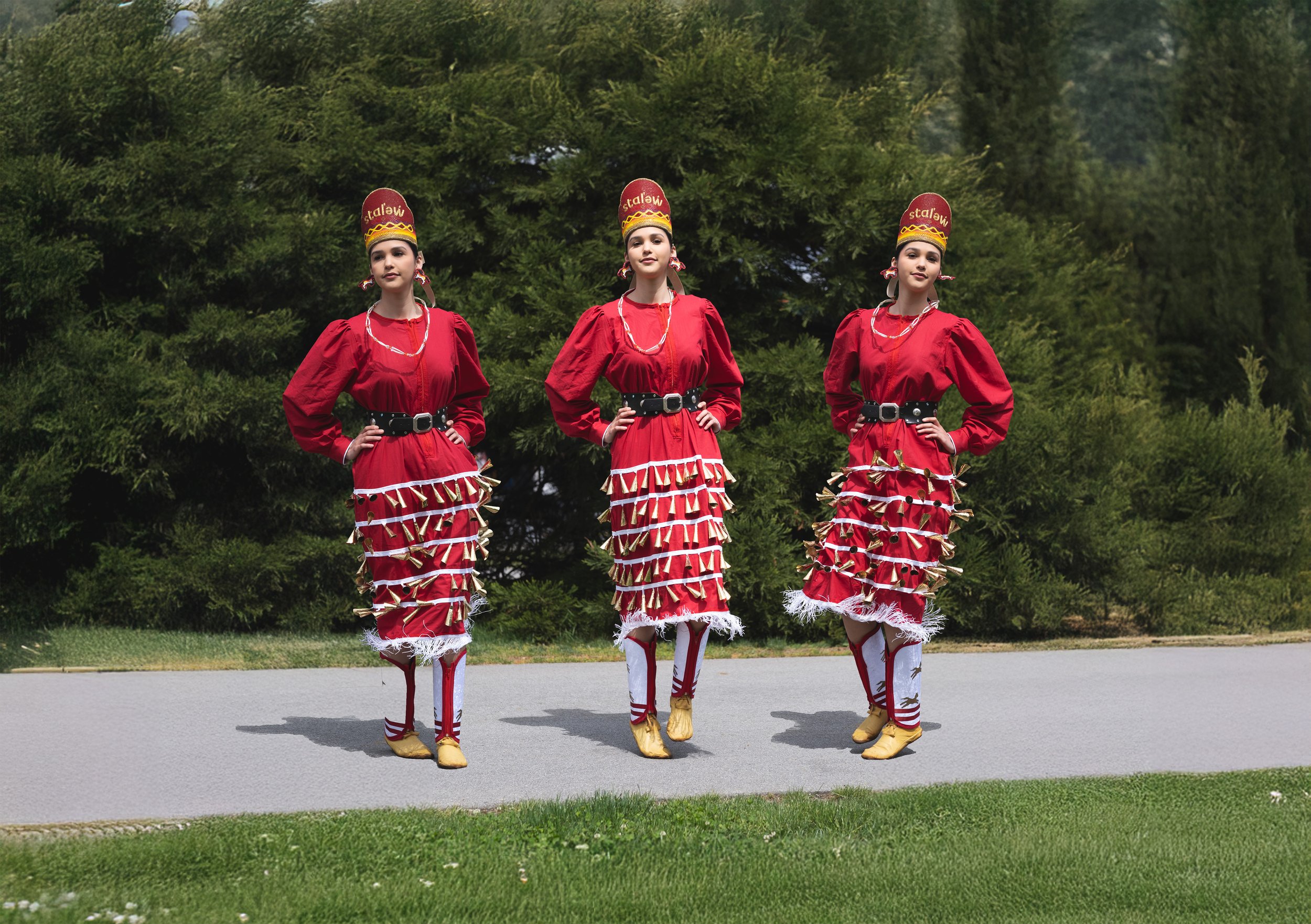
stalew pow-wow
Branding & Identity
Photo credit:
Context
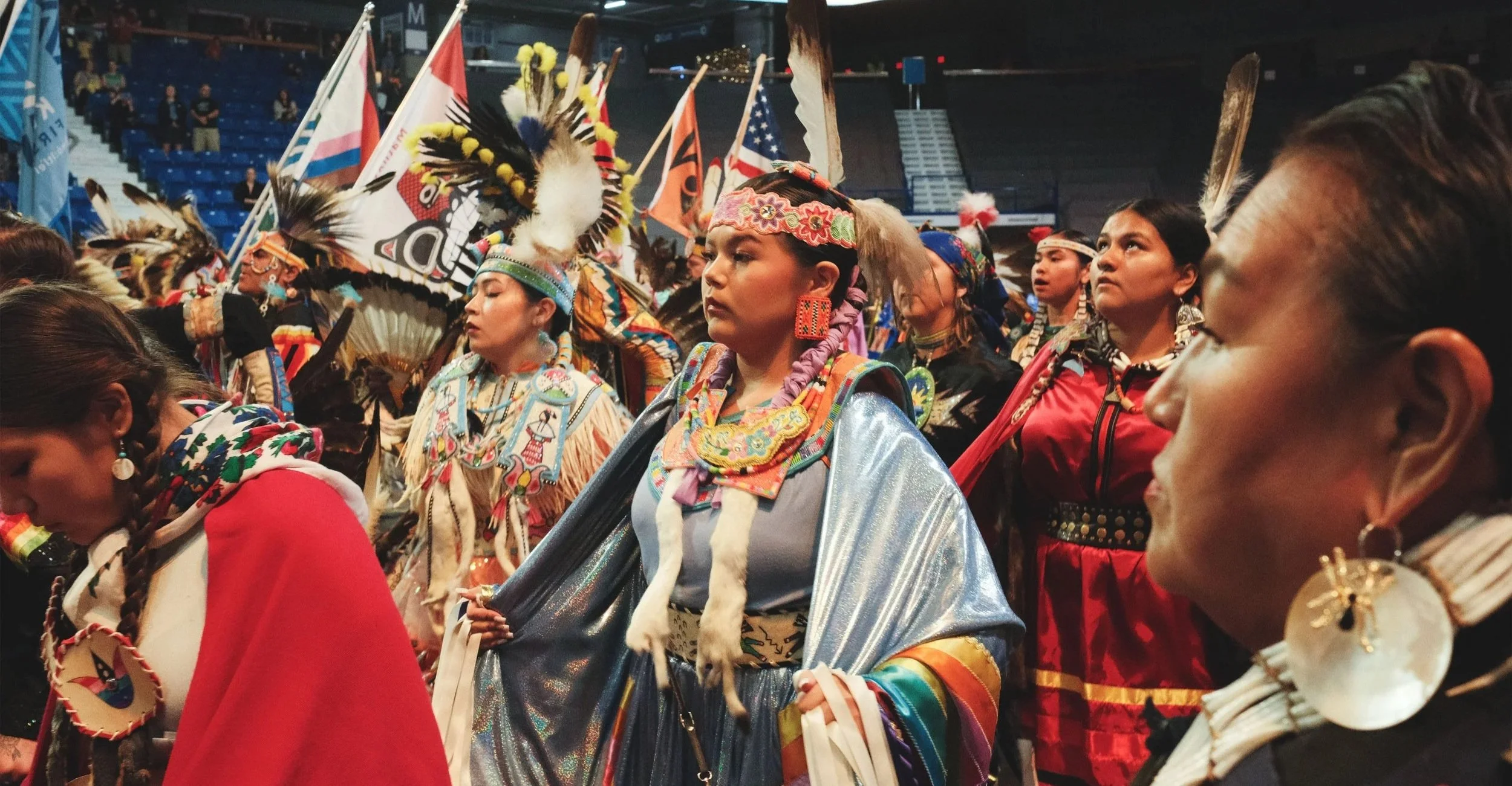
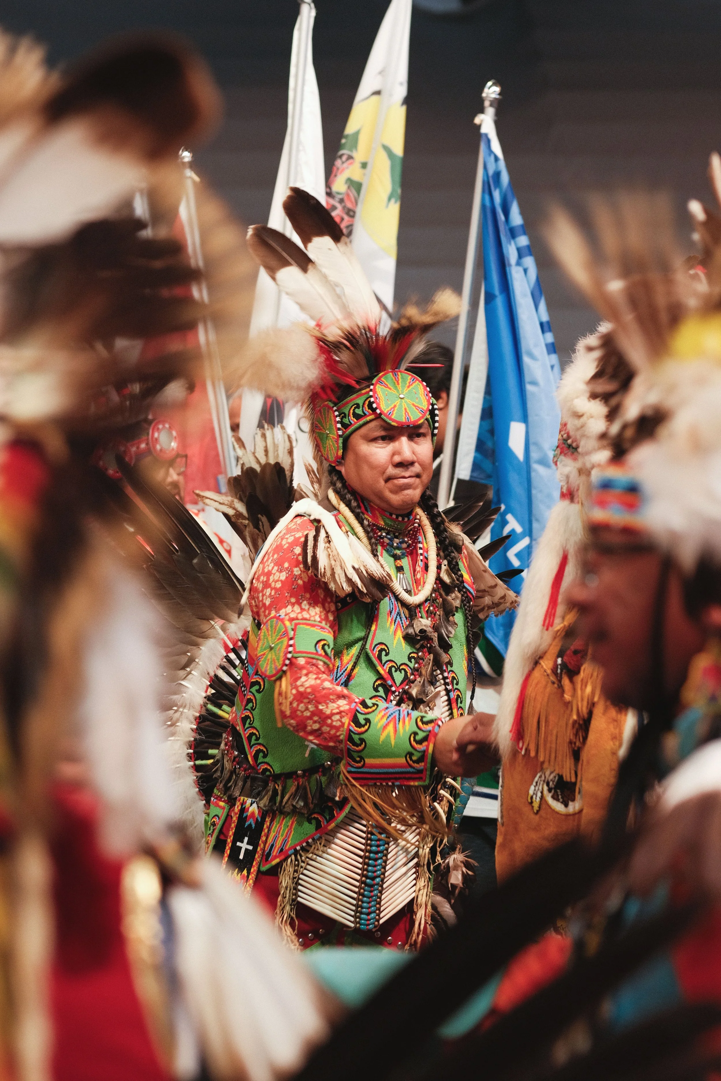
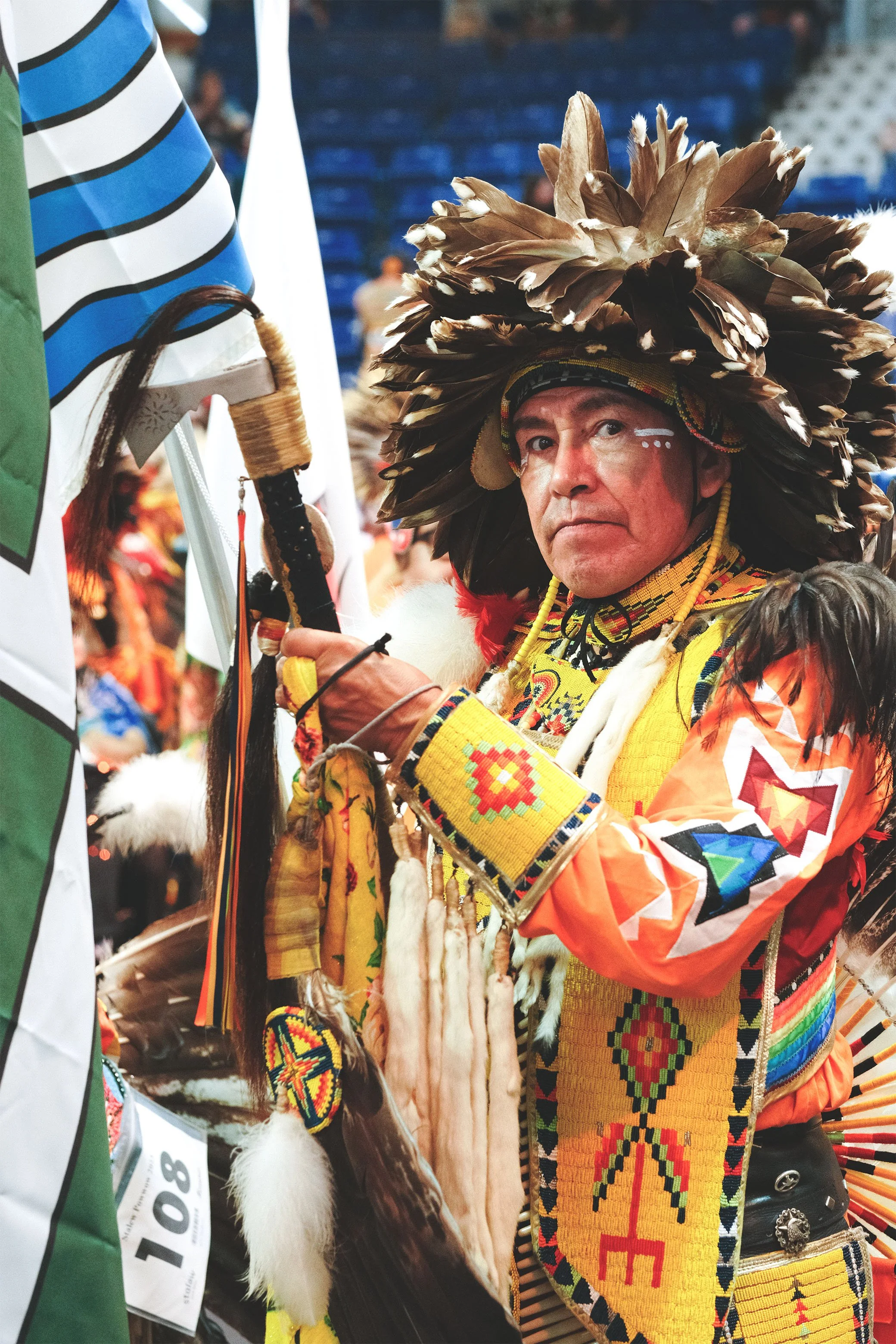
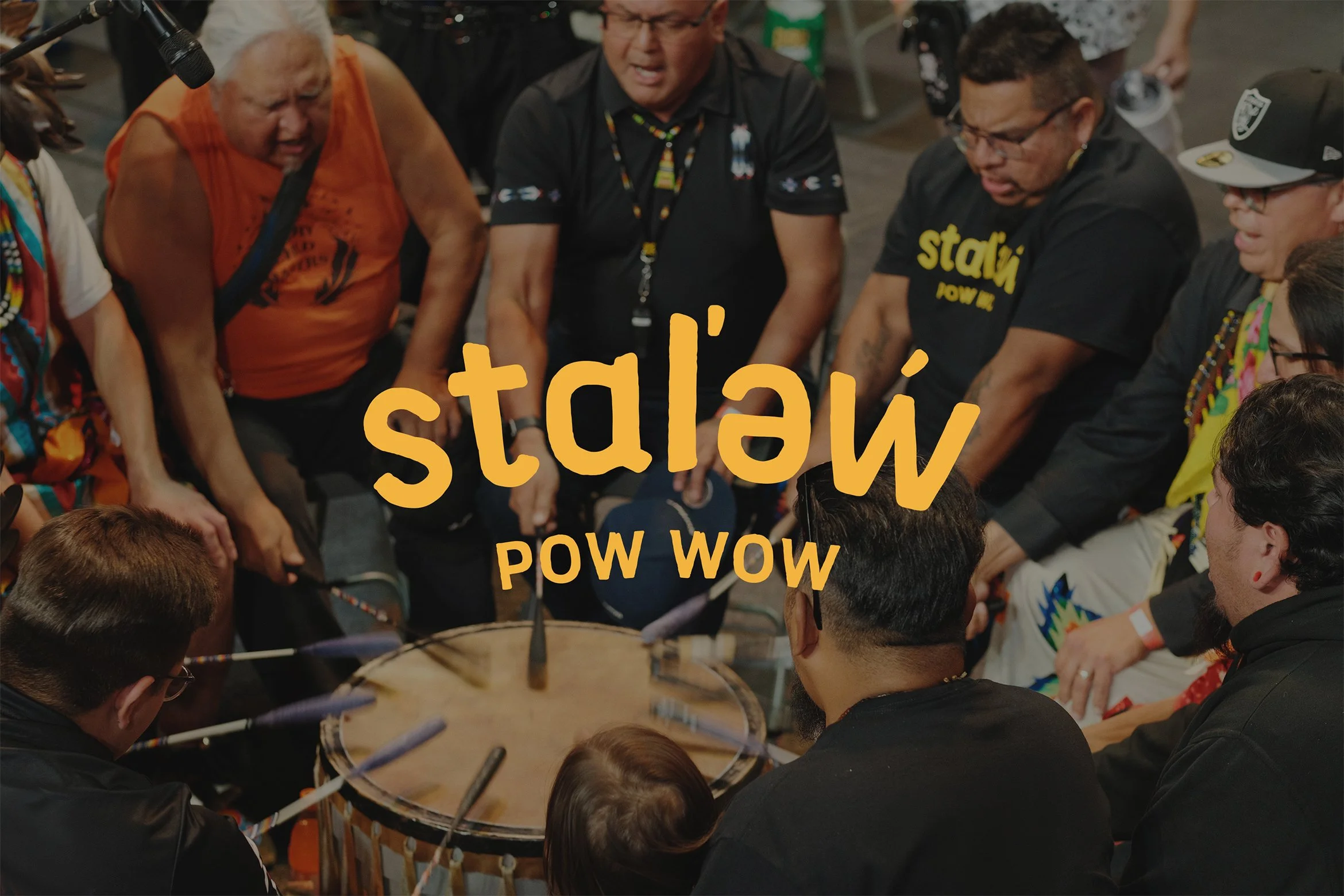
The stɑl’əẃ Arts and Cultural Society were set to organize and host their first pow-wow to celebrate Indigenous culture, traditions, music, regalia and art. The identity needed to honour cultural significance while also functioning as a professional, public-facing brand capable of attracting sponsors and supporting long-term event growth.
Outcome
The identity has been successfully applied across merchandise, large-format banners at the Langley Events Centre, digital platforms, and marketing materials. It continues to support the growth of the pow-wow, now in it’s fifth year, while maintaining a strong, recognizable presence rooted in place and purpose.
Approach
The logo was developed as a wordmark with an organic, hand-crafted quality, reflecting nature, movement, and the rivers that connect communities along the Fraser River. Care was taken to avoid visual language tied too closely to any single Indigenous style, allowing the mark to remain inclusive and adaptable.
Colour played a key role in the system. A palette of burgundy, warm yellow, orange, and deep forest green was chosen to echo the vibrancy of regalia worn by dancers and performers. Secondary elements, including an undulating wave motif, reference the meaning of stɑl’əẃ -“big river” in hən̓q̓əmin̓əm̓ - and are used selectively to support the identity without overwhelming it.