Woven cedar films
Branding, Identity & Website
Context
Nate Dickson had been working as a videographer under his own name for years, building a reputation for documentary and community-focused work across the Lower Mainland and beyond. His client list included First Nations organizations, non-profits, and public institutions, but his brand didn't reflect that focus.
Nate Dickson Media positioned him as an individual for hire. He wanted to lead a production company, attract clients in the Indigenous and non-profit sectors, and elevate his services accordingly.
The rebrand required more than a new logo. It required a new name, one grounded in who Nate is, what his work means, and where he wants to take it.
Outcome
"The new branding signalled an outward shift I had been experiencing internally in myself and my business. I wanted to focus on telling non-profit and Indigenous stories, and my old logo and website didn't signal that to clients.
Since working with Peter on the name and website, and with my father on the new logo, I've had extremely positive feedback on the rebrand. It has helped focus my business and show prospects the types of projects I specialize in.
It now tells the story of why I created the business, and how it's helped me rediscover and embrace my heritage."
— Nate Dickson, Woven Cedar Films

Approach
The process began with a structured discovery session, a series of questions and mind-mapping exercises designed to surface the values, culture, and purpose behind Nate's work. Nate is a member of Kwantlen First Nation, and his identity as a Coast Salish filmmaker is inseparable from the stories he tells. That connection became the foundation for the new brand.
The name Woven Cedar Films emerged from that process. Cedar holds deep significance in Coast Salish culture, a symbol of strength, protection, and revitalization. Cedar weaving is a practice used for ceremony, sustenance, and everyday life. Just as cedar fibres are brought together to create something purposeful and enduring, Nate's work weaves together image, voice, and memory to reflect the work back to itself.
The logo has its origins in a sketch by Nate's father. The form he explored was the Coast Salish eye, a symbol representing the watchful presence of the Creator. Working from that sketch, the mark was refined and simplified: clean geometry, confident weight, and the ability to hold its own at any scale and across any medium. The cedar weave pattern originally placed inside the eye form was removed during refinement, the eye alone, resolved and uncluttered, carried more authority.
Typography was selected to complement the mark, balancing contemporary clarity with a character appropriate to the brand's cultural grounding.
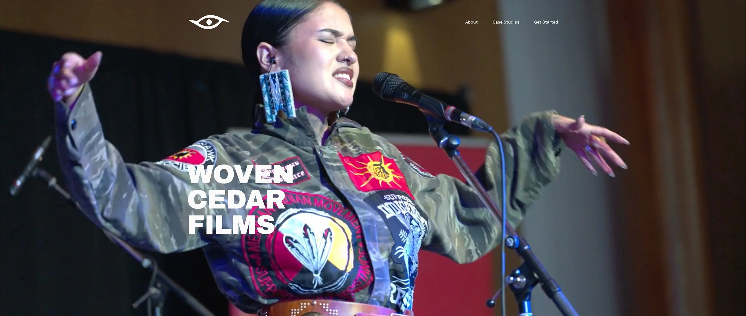
The website, built on Squarespace, was designed to match the elevated positioning of the new identity. Where the previous presence had been personal and informal, the new site presents Woven Cedar Films as a production company with a defined focus, a clear body of work, and a roster of valued partners.
Process
Discovery session and collaborative naming
Logo development from family sketch through to final mark
Typography selection and brand system
Website design and build (Squarespace)